


22 Jul Responsive Web Design
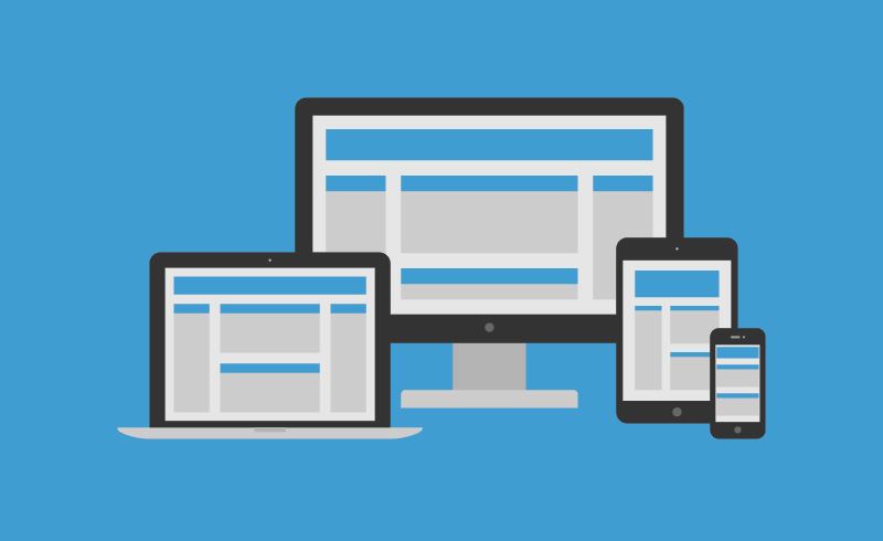
Is your website responsive? Over the past 5 years the web design industry has shifted focus from building various sites to accommodate desktop computers, tablets and mobile devices to a Responsive Web Design approach (RWD).
Users need quick access to content and planning a website from mobile to desktop even large screen HDTVs. RWD is the practice of building a site that adjusts in size depending on what device you are using to view the content.
One of the major changes that has occurred is content that used to be cluttered on large screens are streamlined or hidden when the same site is being viewed on a smart phone. Build the site once and deploy everywhere.
Take a look at my portfolio. Most of the sites I’ve built using this design approach. I focus on best practices for user experience and an engaging visit to your site.
Fill out the contact form and ask how I can help you consolidate your various platforms into one.